Search Focus Are A SEO Company That Can Increase Your Online Sales Revenue Through Driving Qualified Targeted Visitors To Your Website
How to Optimise Images for Faster Website Load Times
Images can make a website feel professional, trustworthy and useful. They can also make it painfully slow.
That second part is the one I see far too often. A homepage looks attractive in the editor, the business owner is happy, and then the live page takes several seconds to settle on a mobile connection. Visitors do not wait politely. They tap back, compare another supplier, or assume the business is not as polished as it first appeared.
How to Optimise Images for Faster Website Load Times is not only a design topic. It affects SEO, enquiries, paid advertising performance, accessibility, user confidence and conversion rates. From reviewing and improving websites over many years at Wigan SEO, I have found that oversized images are one of the most common technical problems on small business websites, especially WordPress sites built with visual page builders.
The fix is rarely one magic plugin. Better results usually come from a repeatable workflow: choose the right format, resize before upload, compress sensibly, serve responsive versions, lazy load below-the-fold media, and test the page afterwards.
Why image optimisation matters so much
Images often make up a large share of a page’s total download size. A single uncompressed banner from a modern phone can be 4 MB, 8 MB or even larger. Add a few gallery images and a background section, and the page becomes heavy before the written content has even been considered.
Google’s Core Web Vitals give website owners a useful way to think about performance. Largest Contentful Paint, often shortened to LCP, measures how quickly the main visible content appears. If your hero image is too large, incorrectly sized or delayed by poor loading behaviour, LCP can suffer. Interaction to Next Paint looks at responsiveness, while Cumulative Layout Shift measures unexpected movement on the page.
In practical terms, faster pages usually feel more trustworthy. They also reduce friction. If someone is comparing roofers, dog groomers, accountants or ecommerce products, they may not consciously blame image sizes for a slow page — they simply leave.
For wider performance checks, image optimisation should sit alongside crawling, indexing, code quality and page structure. I have covered some of those wider checks in technical SEO for business websites, but images are often the quickest visible win.
| Image issue | Typical result | Best first fix |
|---|---|---|
| Full-size camera uploads | Huge mobile downloads | Resize before upload |
| Wrong file format | Unnecessarily large files | Use WebP, JPEG, PNG or SVG correctly |
| No width and height | Layout shifts while loading | Set dimensions or use theme-generated sizes |
| All images load immediately | Slow first render | Lazy load below-the-fold images |
Preparation guide before changing anything
Do not start by installing three optimisation plugins and hoping for the best. That often creates duplicates, broken galleries, poor-quality thumbnails or unexpected layout problems.
What to check first
Open your most important pages on a phone, not only a desktop monitor. Check the homepage, key service pages, popular blog posts, product categories and landing pages used for ads. If a page is responsible for enquiries or sales, prioritise it.
- Check the page in a speed testing tool and note the largest image files.
- Look for banners, sliders, gallery images, logos and background images.
- Check whether the page builder is loading hidden desktop or mobile images.
- Review whether the same image appears in several sizes across the site.
- Make a note of images that are important for trust, such as product photos or project examples.
Safety considerations
Always back up the site before bulk-compressing media. Seriously. Image tools can overwrite files, remove metadata, convert formats or create new versions. Most of the time that is fine, but a backup gives you a way back if a gallery, product image or design section breaks.
If your website sells products, be careful with aggressive compression. A 15 KB product image may load quickly, but it may also make the product look cheap. Speed matters, but so does clarity. The goal is not the smallest possible file. It is the best balance between visual quality and page weight.
Tools and materials
- A recent website backup.
- Access to WordPress admin and hosting if possible.
- An image editor such as Photoshop, Affinity Photo, GIMP, Canva or similar.
- A compression tool or WordPress image optimisation plugin.
- A browser with developer tools.
- A speed testing tool to compare before and after results.
- A list of priority pages, not just the media library.
Preparation steps
- Record current performance scores and the largest image files.
- Export or back up the original images.
- Decide which pages matter most commercially.
- Resize a small batch first instead of changing the whole media library.
- Test on mobile, tablet and desktop.
- Only then repeat the process across the wider site.
This slower start saves time later. It is much easier to fix one test page than recover hundreds of overwritten images.
Choose the right image format
File format has a big effect on image weight. The wrong choice can turn a simple graphic into a bloated file, or make a photo look rough and patchy.
JPEG
JPEG is still useful for photographs, team photos, project images and visual content with many colours. It supports strong compression, although too much compression creates visible blocks and smudging. For most service business websites, a carefully compressed JPEG remains acceptable when WebP is not available.
PNG
PNG is best for images that need transparency, crisp edges or simple graphics. It is not usually the best choice for large photographs. One mistake I regularly encounter is a full-width photographic banner saved as PNG. The file can be several times larger than it needs to be.
WebP
WebP is widely supported by modern browsers and is usually smaller than comparable JPEG or PNG files at similar visible quality. For WordPress websites, WebP is often the format I would choose for most photographic and general website images, provided the website serves it correctly and keeps sensible fallback handling where needed.
SVG
SVG is useful for logos, icons and simple vector illustrations. It stays sharp at different sizes and can be tiny. Use SVG carefully, because it can contain code. Only upload SVGs from trusted sources and use safe handling in WordPress.
| Format | Best for | Avoid using it for |
|---|---|---|
| JPEG | Photos and project images | Logos needing transparency |
| PNG | Transparent graphics and sharp UI elements | Large photographic banners |
| WebP | Most modern website images | Unsupported or poorly configured setups |
| SVG | Logos and icons | Untrusted downloaded files |
Resize images before upload
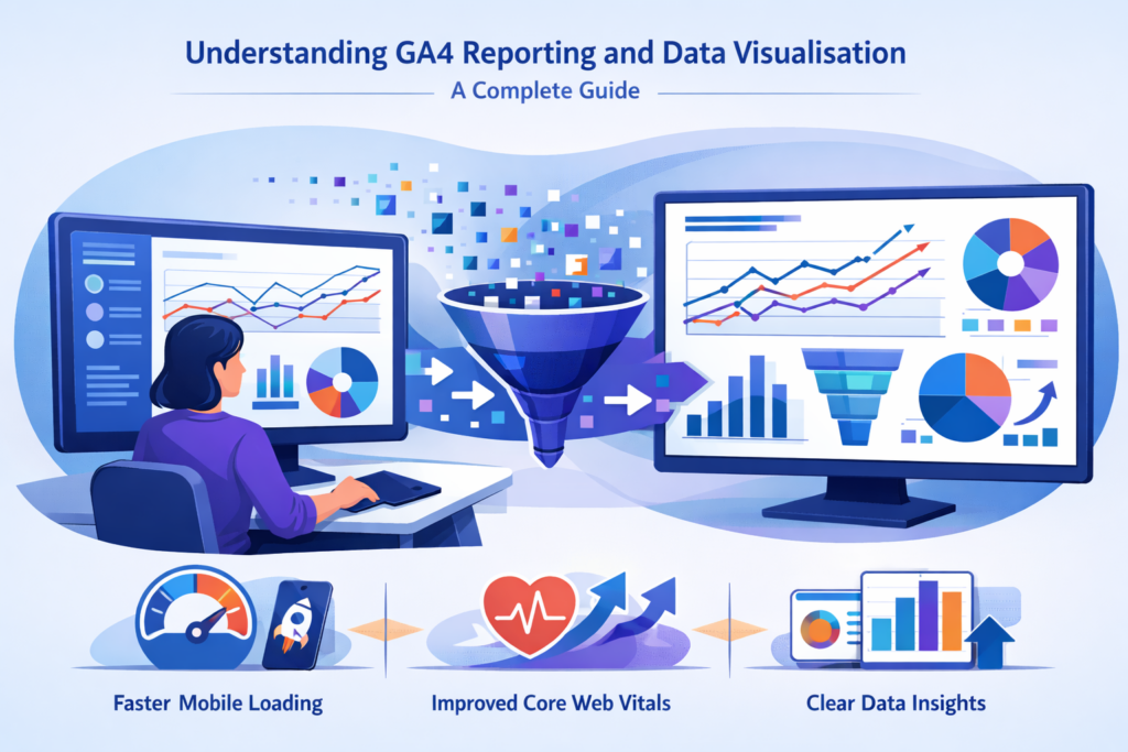
Compression helps, but resizing usually comes first. If your content area displays an image at 900 pixels wide, uploading a 5000 pixel wide original wastes bandwidth. The browser may still display it at 900 pixels, but the visitor has downloaded far more data than needed.
For many business websites, these rough sizes are sensible starting points:
- Hero images: around 1600 to 2000 pixels wide, depending on layout.
- Content images: around 900 to 1200 pixels wide.
- Thumbnails and cards: around 400 to 800 pixels wide.
- Logos: use SVG where suitable, or a tightly sized PNG/WebP.
Those are not fixed rules. A photography portfolio, ecommerce zoom function or high-end product page may need larger originals. A local service page usually does not.
WordPress creates multiple image sizes when you upload media, and themes may add their own sizes too. That is useful, but it is not an excuse to upload enormous originals every time. Big originals still consume storage, backup space and processing time.
If you use Elementor, Divi or WPBakery, check which image size the module is pulling in. A common issue I see on business websites is a small card layout using the full image rather than a medium or large generated version. It looks fine, but it loads far too much data.
Compress without ruining quality
Compression removes unnecessary image data. Lossless compression reduces file size without visible quality loss. Lossy compression goes further by removing data the viewer is less likely to notice.
Most website images can tolerate some lossy compression. The trick is to look at the actual image, not only the percentage saved. Faces, product details, fabric textures, flooring, paving, food and fine text can suffer if compression is pushed too far.
A practical compression workflow
- Resize the image to the largest size it realistically needs to appear.
- Export as WebP or JPEG at a sensible quality level.
- Compare the compressed image with the original at normal viewing size.
- Check the file size.
- Upload and test it on the live page.
For many images, reducing a file from several megabytes to a few hundred kilobytes is realistic without obvious visual damage. A tiny icon may be only a few kilobytes. A large, sharp banner may need more. Context matters.
WordPress plugins can automate much of this, but I prefer to check the first few images manually. Automation is useful. Blind automation is risky.
Use responsive images properly
Responsive images allow browsers to choose the most suitable file for the screen size and display density. WordPress normally adds srcset attributes automatically when images are inserted using standard methods. That means a mobile visitor can receive a smaller version than someone viewing on a large desktop screen.
This only works well when the theme or page builder respects WordPress image handling. Custom-coded sections, background images and some sliders may bypass the normal responsive image system. That is where heavy pages often hide.
The first area I would check is the hero section. If it uses a background image, inspect it in the browser and see which file is being downloaded on mobile. If the mobile device is still downloading a massive desktop banner, create a separate mobile image or adjust the design.
This is especially important for visual trades, landscaping, home improvement, dog grooming and ecommerce websites. For example, project galleries can support trust, but they should not force visitors to download every full-size image before the page becomes usable. I apply the same thinking when planning niche service visibility, such as SEO for block paving companies, where project photos matter but speed still affects enquiries.
Lazy loading: useful, but not everywhere
Lazy loading delays images until they are close to being needed. It is ideal for gallery images, blog illustrations, related posts and content further down the page.
Do not lazy load the main image that appears at the top of the page if it is likely to be the Largest Contentful Paint element. That can delay the very thing the visitor needs to see first. The top banner, main product image or first content image may need to load immediately.
Best use of lazy loading
- Use it for below-the-fold images.
- Use it for long blog posts and galleries.
- Avoid it on the main above-the-fold hero image.
- Test after enabling it, especially on mobile.
Lazy loading can also affect how crawlers and tools see content if it is implemented badly with JavaScript. That overlaps with a wider issue I have discussed in AI crawlers and JavaScript visibility. Images should not be the only way important information is presented, and key text should remain accessible as HTML wherever possible.
Alt text, filenames and SEO value
Image optimisation is not only about speed. Search engines and assistive technologies also use surrounding content, filenames, captions and alt text to understand images.
Alt text should describe the image when the image adds meaning. If the image is decorative, empty alt text can be appropriate. Do not stuff alt text with keywords. It sounds unnatural, it does not help users, and it can make a page feel low quality.
A good filename is short and descriptive. For example, wigan-garden-patio-installation.webp is clearer than IMG_4829.webp. It will not transform rankings on its own, but it supports a cleaner, more understandable website.
As search experiences change, media context can also influence how content is interpreted by answer engines and AI-assisted search systems. That is one reason I treat image labels, captions and surrounding copy as part of broader answer engine optimisation, not as a separate afterthought.
WordPress image optimisation workflow
WordPress makes image handling easier, but it can also hide problems. Media libraries grow quickly. Themes generate extra thumbnails. Page builders store settings in different places. A site may look simple from the front end while carrying years of unused media behind the scenes.
Main instructions
- Back up the site and database.
- Identify the top 10 to 20 pages by traffic, enquiries or commercial value.
- Test those pages and list the heaviest images.
- Resize originals where they are clearly too large.
- Convert suitable images to WebP.
- Compress images at a sensible quality level.
- Check that WordPress is serving responsive sizes.
- Lazy load non-critical images.
- Retest speed and inspect the page visually.
- Repeat across templates, galleries, products and blog content.
If you use an SEO plugin, remember that it will not fix image weight by itself. It can help with metadata and indexing controls, but performance needs separate attention. For WordPress owners, I have written more about plugin expectations in Yoast SEO for WordPress websites.

Be careful with bulk tools
Bulk optimisation is tempting. One click and hundreds of files are processed. Lovely idea. But test first, especially if the site uses product galleries, before-and-after sliders, lightboxes or downloadable media.
Some tools store original backups. Some overwrite them. Some create WebP copies while leaving the original file in place. Check your hosting storage after optimisation because duplicate versions can increase disk usage even when front-end delivery improves.
Common problems and fast fixes
Problem: the homepage is still slow after compression
This usually happens because the largest image is not the only issue. Sliders, videos, fonts, tracking scripts, unused CSS and page builder assets may also be slowing things down. The fastest solution is to test the page and identify the actual LCP element rather than guessing.
To fix it, remove unnecessary sliders, replace oversized background images, preload the key hero image only if appropriate, and reduce scripts that delay rendering. Signs of a more serious problem include slow server response, heavy third-party scripts, or a page that remains slow even when images are temporarily disabled. Prevent it by testing new design sections before publishing them, not months later.
Problem: images look blurry after optimisation
The cause is usually over-compression, resizing too small, or using the wrong generated image size in the design. The fastest solution is to restore the original for that image and export a better version.
Fix it by checking the display size, then uploading an image slightly larger than the maximum rendered size. On high-density screens, a little extra resolution may be needed. More serious signs include blurry product images across the whole shop or project images that no longer show workmanship clearly. Prevent it by setting quality rules for different image types rather than applying one harsh setting everywhere.
Problem: layout jumps as images load
This is often caused by missing image dimensions or injected content that appears after the page starts loading. The fastest solution is to ensure images have width and height attributes or that the layout reserves space before the file arrives.
Fix it by using properly inserted WordPress images, checking page builder modules, and avoiding image containers with no defined ratio. Serious signs include buttons moving while users try to tap them, forms shifting, or mobile menus jumping. Prevent it with consistent image ratios and template testing.
Problem: the mobile version downloads desktop images
This happens when background images, sliders or custom sections ignore responsive image rules. The fastest solution is to inspect the mobile page and confirm which image URL is being loaded.
Fix it by adding mobile-specific images, using responsive picture markup where suitable, or changing the layout so a normal WordPress image can be used instead of a background. Serious signs include excellent desktop speed but poor mobile performance. Prevent it by checking mobile delivery every time a new hero section or landing page is built.
Speed improvements can also help engagement. If visitors leave before reading, the issue may appear to be content quality when the real cause is technical friction. I have covered related behaviour signals and fixes in technical fixes that reduce bounce rate.
What to measure after optimisation
Do not rely on one score. Performance tools vary between tests, and real users have different devices, connections and locations. Look for patterns.
- Has total page weight reduced?
- Has the largest image file become smaller?
- Has LCP improved on key templates?
- Does the page still look sharp on mobile?
- Are important images indexed and accessible?
- Are enquiries, calls or sales affected over time?
For SEO, speed is only one part of the picture. A faster weak page is still a weak page. The content must answer the search, the layout must support action, and the internal linking must help people and crawlers move through the site. Image optimisation removes a barrier; it does not replace proper page planning.
Results will vary depending on the website, hosting, theme, plugins, competition and starting position. No responsible SEO provider can promise that compressing images will create a specific ranking improvement. It can, though, make the site easier to use and remove a common technical weakness.
A sustainable image process for future uploads
The best image optimisation setup is the one you keep using. A one-off clean-up helps, but future uploads can undo the work quickly.
Create a simple rule for anyone who adds content to the site: resize first, name files clearly, choose the right format, compress before or during upload, add helpful alt text where needed, and check the live page. Keep it boring. Boring processes prevent messy websites.
For a freelancer, this is especially important because clients, designers and content editors may all touch the same site. Clear upload rules reduce rework and keep performance from drifting over time.
My normal recommendation is to optimise the pages that make money first: main services, local landing pages, ecommerce categories, product pages, quote forms and high-traffic blog content. Once those are improved, work through older media and templates in batches.
Faster image delivery will not fix every SEO issue, but it is one of the most practical improvements a business can make. It improves the first impression, protects mobile users from unnecessary downloads, and gives important content a better chance of being seen.